
2026 Stainless Finish Trends in SEA
Southeast Asia's 2026 finishes lean toward warm PVD tones, mixed metals and brushed steel. See which colours suit retail, hospitality and humid cladding.
Warm PVD tones take the lead
Across retail and hospitality projects in the region, warm PVD tones continue to displace bright mirror silver. Champagne, rose gold and soft bronze read as inviting rather than clinical, and they flatter the warm woods, stones and warm-white lighting common in Southeast Asian interiors. The practical reason matters as much as the aesthetic: a brushed base under PVD hides the fingerprints that mirror finishes show instantly in a humid, high-touch environment. Specifiers are also moving away from very yellow gold toward muted, slightly desaturated variants that age more gracefully and tolerate mixed schemes. When choosing a warm tone, judge it under the actual colour temperature of the site and keep a signed sample for every delivery, since perception shifts between a showroom and a finished space. It is worth remembering that the market picture described here is a synthesis of common design directions, not a claim about measured sales data or named clients; treat it as a practical guide to what is being specified rather than a statistic.
Mixed metals and deliberate contrast
Single-finish interiors are giving way to controlled pairings. The most common combination pairs a dark structural metal, such as black titanium or gunmetal, with a warm accent applied only to edges, trims and focal pieces. This approach adds depth without the confusion of using two equally dominant colours. In practice, decide the split before ordering and hold it in the finish schedule: roughly eighty percent dark structure and twenty percent warm accent is a reliable starting point for a shop or lobby. The two tones should also be separated by function, with the darker finish on frames, screens and shelving uprights, and the warmer one on cabinet edges, counter lines and wayfinding. Because PVD colour can shift with chamber conditions, insist that all coated components for one project are planned in one run where possible, and approve coded samples from different batches side by side when they are not. A calm, repeated palette reads as premium; a random mix of five finishes reads as a supplier with too much stock to clear.
Tactile surfaces and climate sense
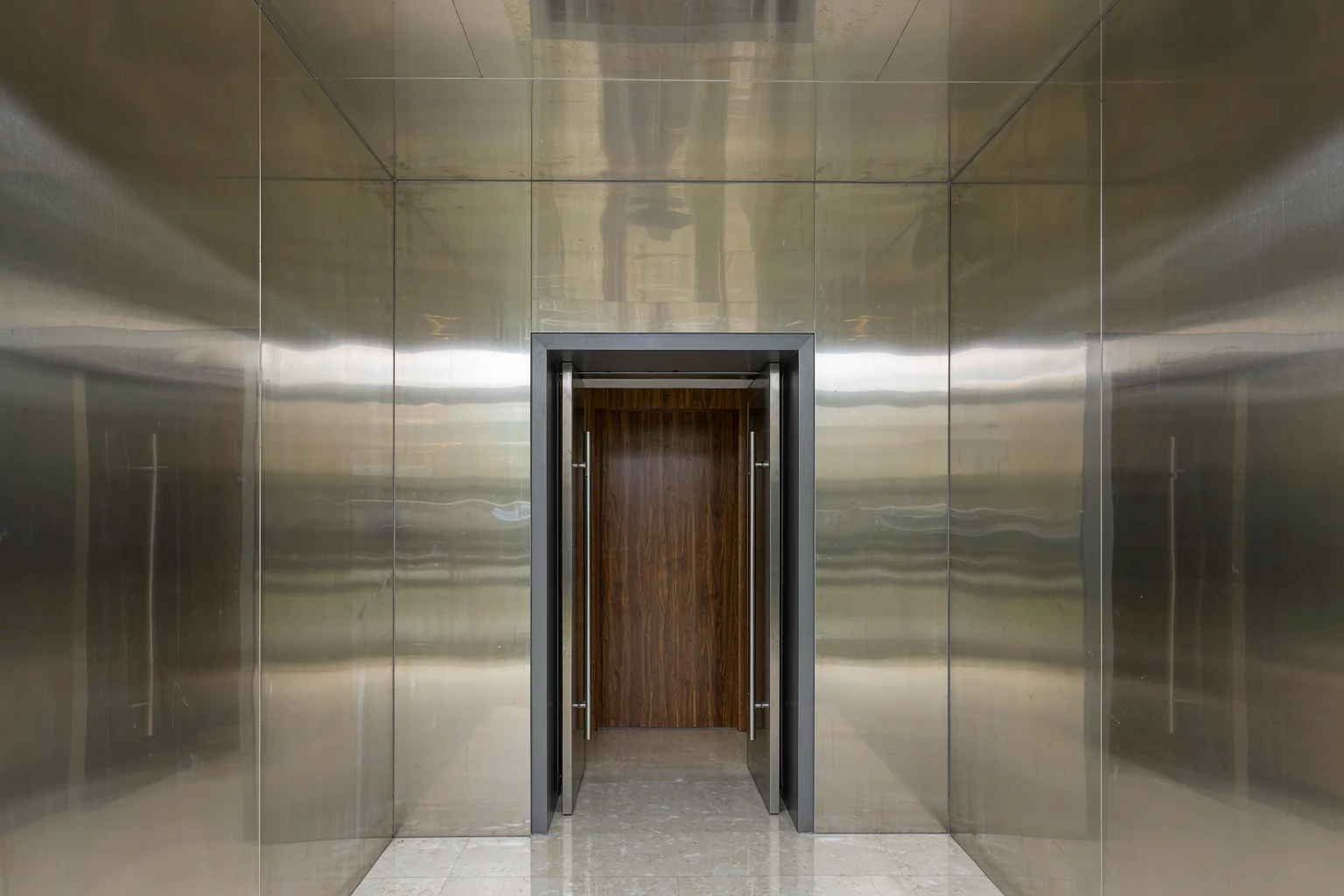
The third direction is texture you can feel. Brushed, bead-blasted and lightly linear-finished steels are being specified for large surfaces where a mirror would show every smudge and wave. A satin surface diffuses light, hides minor handling marks and feels warmer under the hand, which suits tropical interiors. In humid climates, the base grade still matters more than the colour: 304 is the practical default for most interior fit-outs, while 316 earns its cost near pools, fountains or coastal salt air. Whichever grade you choose, specify adequate thickness and a rigid backing for broad panels so they do not ripple, and insist on deburred edges and protective film suited to sea freight. Cleanability should be part of the finish decision, not an afterthought; ask how each surface responds to fingerprints, tea, oil and routine mild detergents. We supply display cabinets, screens, coloured sheets, racks, aluminium carvings and bent parts to drawing, and can discuss finish selection on WhatsApp +86 17324671020 or by email at chen847415774@gmail.com, with a reply within 24 working hours.
Factory and project images are AI-generated illustrations, not photographs of a real facility or completed project.
Have a drawing ready?
Send it on WhatsApp or by email. Get grade, finish, MOQ and lead time back within 24 working hours.