
Pairing PVD Gold With Black Titanium
Mixing PVD gold and black titanium in one interior can look deliberate or chaotic. Learn to divide surfaces, control undertones and keep colour consistent.
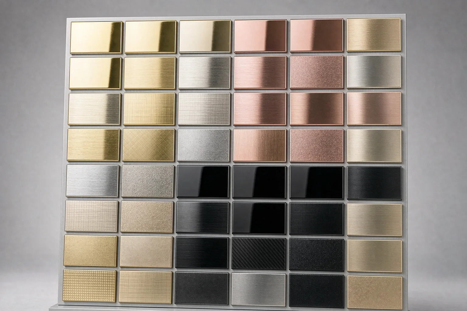
Give each finish a role
Two metals work in one room when each has a job. A common and reliable pattern is to let black titanium establish the structure, such as screen frames, door reveals, shelving uprights and long lines of cladding, then use PVD gold as the accent on the parts the eye lands on: cabinet edging, a counter trim, a logo band or the border of a decorative panel. If both colours cover the same amount of area, they compete and the space reads as indecisive. Decide the ratio before ordering, and a split of roughly eighty percent dark to twenty percent warm is a useful starting point for retail and hospitality interiors. The same logic applies vertically: darker tones feel natural at the base and on tall framing, while warmer gold draws attention at eye level and near the point of sale. Write the allocation into the finish schedule so the installer does not have to guess which panel receives which coating.
Control undertones and lighting
Gold PVD is not one colour. Depending on the chamber conditions and the base finish, it can lean yellow, champagne, rose or bronze, and black titanium can read as warm charcoal or cool graphite. When you pair them, decide which families you are combining before samples arrive. A yellow gold sits comfortably with a neutral grey-black, while a rose or champagne gold can clash with a blue-tinted black under warm lighting. Always approve samples together, under the same light colour temperature that the finished space will use, and view them both upright and angled, because PVD changes with the viewing angle. Retail environments often use 3000 K to 3500 K lighting to flatter warm metals, while a cooler 4000 K can make gold look greenish. Keep a signed sample set on site as the reference for every delivery, since a batch produced months later should still match what you approved at the start.
Keep colour consistent across batches
The fastest way to ruin a two-tone scheme is to receive cabinets from one batch and screens from another. Even with the same nominal colour name, small differences in chamber load and base preparation can shift the undertone. Plan the order so that every visible PVD part for a project is coated in one run wherever possible, and state this on the purchase order. If the quantities make a single run impossible, ask for coded samples from each batch and approve them side by side before dispatch. Protect the finished surfaces during transport, because a scratch that cuts through the PVD layer cannot be touched up with a marker; it needs a repaint or a replacement part. For a large cladding area, ask about panel sequencing so adjacent pieces come from consecutive positions in the coating chamber. We supply display cabinets, screens, coloured sheets, racks, aluminium carvings and bent parts to drawing, and can discuss colour matching on WhatsApp +86 17324671020 or by email at chen847415774@gmail.com, with a reply within 24 working hours. Record the chamber batch, keep the signed sample set on site, and inspect the first delivery before the remaining crates leave the workshop.
Factory and project images are AI-generated illustrations, not photographs of a real facility or completed project.
Have a drawing ready?
Send it on WhatsApp or by email. Get grade, finish, MOQ and lead time back within 24 working hours.